Wednesday, February 28, 2018

Using ArcGIS to find sinkholes and closed depressions

Finding sinkholes remotely is a lot faster than walking around in the woods and hills looking for sinkholes. I've done it. It is great to be out in the field and away from the office, but using GIS to find them, or at least find most of them, saves time and money. Of course what your GIS model found has to be groundtruthed by going in the field.

To solve this problem I went about modifying a model given by an Esri training model on identifying closed depression where cloudburst flooding might pool up and cause infrastructure damage. I decided to try to use this model to find sinkholes here in Alabama, but this model could be used elsewhere. 

For this project I focused on Morgan County, Alabama because it  has some of the highest numbers of sinkholes for any county in Alabama. I got a shapefile from the Alabama Geological Survey of all the recorded sinkholes in Alabama and clipped that to the shape of Morgan County. This was my control to compare my model to. 


Morgan County in red. 


Digital elevation model of Morgan County, Alabama. Elevation is in meters.


To begin, you first need to get a digital elevation model (DEM) of the area you are working in. A 10-meter is probably going to be the easiest to come by, but the resolution isn't the greatest. If you can get 5, 3, or 1-meter DEMs you are going to get much better data. I managed to get a 1-meter DEM for a small section of Morgan county that had a large cluster of sinkholes. 

The National Map is one of the best places to get elevation data. I got whole county 10-meter DEMs from Alabama View. 1-meter DEMs can sometimes be found here, but if you select a whole county the file size will be too large, and they won't let you download more than 8 Gb for some reason. So, select your study area using order by interactive map.


This was my final model and as you can see it has my own inputs still in it.


The basic workflow is as follows:

1. Run a fill on the DEM with no Z-limit set

2. Run the fill again on the original DEM with a Z-limit of about 1 meter. This may take some tweaking for find what works best. The smaller the Z-limit the longer it will take to run. My final run I used a Z-limit of 0.5 (meters).

3. Run the minus tool on the two DEMS. I named the DEM with no Z-limit 'all_sinks' and the 0.5 meter Z-limit one 'small_sinks'. You want to subtract the 'small_sinks' from 'all_sinks'. 

4. Give the output of the Minus to the Con tool. You can run Con by itself and give it the appropriate raster, Value > 1 for the expression, and 1 for input true raster. Alternatively you could use the Raster Calculator and feed it Con("<sinks_minus_output>", 0, 1, "Value > 1"). Either way you do it 1 should be all the sinkholes found from subtracting the two rasters, and zero everything else.


5. The conditional raster output from the Con tool is then fed into the Region Group tool. 

6. Run Raster to Polygon on the Region Group output. This will turn each area on the raster with a value > 1 into its own polygon feature. Now we will be able to select them individually, find perimeters, or calculate area.   

7. Give that output to the dissolve tool. (optional)

8. Lastly we can feed the dissolve data into the Make Feature layer. (optional) I'm not so sure these last two steps were absolutely necessary, but Esri had them in their training model. I would probably skip these to save time. 

Above I showed the model I built in the Model Builder. You can do this if you want the model to just run the entire thing on its own. I found that this can be finicky and may crash for no real reason. A second option is to make the model, validate it, then export it as a Python script. You can do this in the Model Builder by going to Model -> Export -> To Python Script. This will convert your model into, well, a Python Script. Then you can either run it stand alone, or drop the script into a new model as you would a tool, and run the model with just the script. I found this was less prone to weird cashes and errors. For a look at my model as a Python script take a look here.

My study area was an area of northern Morgan county I selected which had a large cluster of sinkholes. There were 195 sinkholes that were recorded by the Alabama Geological Survey as of 2011 in this area. The model managed to identify 152 of the 195 or 78%. However, the model also drew 3313 features. That means 3161 were false positives. Many of the false positives were ditches, roads, streams, etc. Most of these were just noise, which is what Fill is supposed to fill in. 

Of all the true sinkholes the smallest had an area of 694 meters^2. The smallest perimeter was 115 meters. I decided to remove all features smaller than 115 meters perimeter. This cut all the features down to 601. Many of the drawn features actually contained multiple sinkholes, 50 in total. 


Here we can see all the features ArcGIS drew in red and the recorded sinkholes as green dots. Note the features in the northeast corner. This is a residential area. The long linear features along the river on the west side are wetlands.
This model is far from perfect, but with more data, time and tweaking it could be much better. Doctor and Young (2013) did a similar but much more refined process for finding sinkholes in northern Virginia for the USGS.  

Sunday, February 25, 2018

Why 27.306(x)^2 - 238.96(x) + 510.08?

To get ArcGIS to properly calculate the radius of the buffers for each earthquake I looked at Keefer, 1984 - Landslides caused by earthquakes. In his paper he noted that with an increase in earthquake magnitude landslides occurred in a larger area around the epicenter. I had to work backwards from one of his figures (Figure 2B) as he gave no formula for the curves in his figures. 


Keefer, 1984 Figure 2B


I snipped the figure out of the PDF and brought it into Illustrator. I could now find out what the distance from the epicenter each magnitude was plotted as. I made a grid and measured the distances, and with a little algebra could find out each one. I then plotted those into Excel and had it make me a curve. Finding that curve by hand would have been rather difficult. 


Keefer's curve as plotted in Excel. 


The curve was polynomial with the formula being y = 27.3606(x)^2 - 238.96(x) + 510.08. This is pretty close. It is actually gives a value a bit larger than what it should truly be. As you can see the trend line matches more closely beginning around a magnitude of 7 and above. I tested it using a magnitude of 7 which had an original value of 163. The formula gave 175. Close enough. A little large is probably better than smaller. One important thing to note is that earthquakes with a magnitude below 5.06 cannot be used. This is because the calculation gives a negative number below 5.06. 


These columns were added to ease computation of the radius.

To make this whole this work I had to make new fields in the attribute table. I found it worked best when I used one for 27.306(magnitude)^2, 238.96(magnitude), and 510.08 as its own column. For whatever reason ArcGIS didn't like to calculate correctly when I plugged in the formula straight forward. So I broke it into pieces and fed each one back in. It also calculated the radius of the buffer circle in meters, so I had to convert to km by multiplying by 1000. These buffers were way bigger than I would have expected. For a magnitude 7 it drew a circle 350 km in diameter!


Just about anywhere along the Alaskan coast would have been suitable, however a larger city seemed more suitable for this study.

Earthquake induced landslide hazards in Anchorage, Alaska and Los Angeles, California - A comparison


For this project I decided to compare the risk of earthquake induced landslides around Anchorage, Alaska and western Los Angeles, California as both areas are affected by active seismicity. 
To do my comparison I first acquired data on cataloged earthquakes in Alaska and California. The following were done on data for both study areas:

- Drew buffers around earthquakes where the radius = 27.306(x)2 – 238.96(x) + 510.08, based on Keefer, 1984 and derived using Excel. I explain it here.
- Slopes were derived from 10 DEMs.
- Ran Con on the rasters of the slopes for all slopes above 30° and all slopes above 45°, then converted them to polygons.
- Land cover rasters were converted to polygons and all but the urban sections were removed. 
- All slopes of 30°+ were selected within 50m of urban areas, buffered and dissolved. Same for 45° for 50m and 150m.
I chose 30° and 45° as they are a bit below and above, respectively, the angle of repose for most geological materials. 


Figure 1 - Earthquakes in Alaska with buffers drawn around them. All earthquakes were magnitude 6 and above.


Figure 2 - Earthquakes in California above magnitude 5.06.


Significantly more areas with steep slopes near or intersecting urban areas were found in California. The Anchorage DEM covered approx. 5824 km2 with roughly 37 km2 at risk (Figure 3). The California DEM covered approx. 10192 km2 with about 1262 km2 at risk (Figure 4). 


Figure 3 - Alaska, Anchorage Area
Figure 4 - California, Los Angeles Area


To ‘ground truth’ how well my model worked I used Google Earth’s Street View in a few selected places. Street View seems to have corroborated my GIS findings as seen in figures 6 and 8.


Figure 5 - One of the few areas with steep slopes in the Anchorage Area. 

Figure 6 - Google Earth Street View Image of the the area in the above map. Going south along Hatcher Pass Road, north of Fishhook, Matanuska-Susitna County, Alaska, . It is evident that the DOT is aware of this area as a hazard as the outcrop has been cut back from the road and a fence has been put in to keep loose boulders from making it to the road. The rocks here are sedimentary.


Figure 7 - A section of the Pacific Coast Highway near Big Rock, Los Angeles County, California. Significant areas at risk can be seen here, the red being areas with slopes of 45° or more within 50m of urban areas (roads included).  

Figure 8 - The same stretch of the Pacific Coast Highway shows in Figure 6. Note how close the slope comes to the road, and how steep it is. 


This model is far from perfect as it doesn’t consider lithology, soil conditions, engineered slopes, the role of vegetation, or precipitation, which all factor into landslide occurrence.

The full report can be viewed here.

Tuesday, February 20, 2018

Converting a Land Use raster to Polygons, and keeping it usable

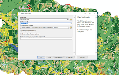
So, you have a land use raster (or any other raster with different values) but it is ugly, so you want to convert it into polygons. Of course you want to run Raster to Polygon, and sure it will work, but oh noes! All my polygons are the same color! What to do?


A land cover raster, but the cells are massive, and rather ugly. 


First run Raster To Polygon. I recommend clipping the raster to whatever area you are working in because a state sized raster will take quite a while to convert to polygons. Before you hit run change the FIELD (optional) from Value to LAND_COVER. Now it will properly assign the polygons to the LAND_COVER attributes.


Next go to Properties -> Symbology -> Categories -> Unique values. In the Value Field drop down select LAND_COVER. If you have a style layer you can import it using the import button. If not you will have to manually change each color if you want to match the original raster. Or you can choose from a color ramp. The order of the values be changed by clicking on the value and using the arrows to the right to move them up or down (great if they are numeric values).


Here are the two side by side for comparison:


And using the Identify tool shows that they retained their LAND_COVER values, and it looks a whole lot better. Now spatial queries should be easier to do.


Tuesday, February 13, 2018

Geomorphology and Watersheds


For our first project I decided to create two watersheds using ArcGIS 10.6 and compare the stream average gradient and sinuosity of all the streams in each watershed. Initially I wanted to see if urban land cover might be a driving factor in increasing stream gradient and sinuosity. 

Since we are here in Auburn, Alabama I created a watershed around Auburn, and for comparison created one just to the east where, from the map, I could see far less development. I used Arc’s Hydrology tools to trace out streams and delineate watersheds. I created a file geodatabase with the features classes, one for each watershed, and traced streams I wanted to compare.


I found a Python toolbox called Calculate Sinuosity which conveniently can iterate through a shapefile or feature class of streams, calculate the sinuosity, and adds that to a newly created field in the attribute table. I spent a lot of time trying to figure out how to make ArcGIS calculate stream gradient before re-discovering Tom Dilts’ custom toolbox Stream Gradient & Sinuosity Toolbox for ArcGISv10. It didn’t like my streams in the feature class, so I decided to use Stream to Feature to convert my streams raster (which I had clipped to each watershed) into polylines, and fed that to the tool - success. I then used the statistics function to find average gradient/slope, sinuosity, and length.


I found that the two watersheds were nearly identical. Chewacla Creek Watershed, which Auburn is in, has 20% urban cover compared to 1.77% in the Little Uchee watershed, and yet sinuosity and gradient were very similar. There was greater relief in the Little Uchee, but more urban cover in Chewacla. I suspect these two might balance one another. Or other factors are at work; more work needs to be done.


Attribute
Chewacla Creek Watershed
Little Uchee Watershed
Area
162.22 km2
165.92 km2
Streams
377
376
Relief (meters)
120.082
148.025
Average slope
0.033°
0.041°
Average sinuosity
0.907
0.897
Average length
991 meters
962 meters
Urban cover
20.89 %
1.77 %
Forest Cover
65.08 %
92.38 %
Agricultural cover
7.56 %
3.42 %
Open water
6.44 %
2.44 %